
VYBE is an app for people who go to shows. It finds the ones worth your time, helps you plan the ones you commit to, makes the day itself easier once you are inside, and keeps a record of every night you were there.
It is free, has no ads, and does not sell your data. This page explains every part of it in plain words, in the same order as the menu in the app.
What this is, how to get going, and the thinking behind how it's put together.
Most people already run a version of this out of a notes app, a group chat and a camera roll full of schedule screenshots. VYBE puts the whole thing in one place, then adds the parts a phone can do better than you can, like noticing that an artist you love just announced a show in your city.
It started with the small problems that ruin a good weekend: forgetting where the car is, screenshotting a schedule that changes anyway, losing your friends the moment the signal dies, walking across a field to a vendor you could have skipped. None of that needs a new app on its own. Together, they add up to one.
Four things do most of the work.
Home learns your taste from the artists you follow and the music you listen to, then puts the right shows in front of you, near you, with a reason on every card. Explore is the whole catalog when you already know what you want.
Build a set schedule that catches clashes for you, keep the whole crew in one room with a meetup spot and a list of who brings what, and check the weather for the actual days before you pack.
The Festival Map puts the stages, gates, water and restrooms from the official map in your pocket, with what is playing on every stage right now. Drop a private pin on your car, then let the map walk you back to it in the dark. It all keeps working with no signal.
Check in at the venue and the night becomes yours for good: a verified star on your Constellation, a badge on your profile, a place in your history. Along the way there is a Mochi to collect and Kandi to make and gift, because not everything has to be logistics.
This guide follows the app's own menu, top to bottom, so the contents above and the menu in the app have the same shape.
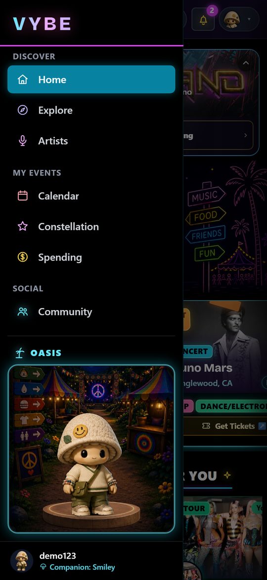
The top group in the menu: Home, Explore and Artists. This is how you find your next show.
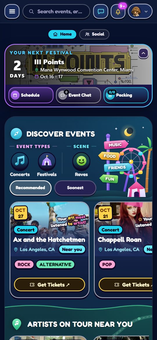
Where you will spend most of your time. It learns your taste, your friends and your cities so you stop searching and start finding.
Home is the only page in the app that is entirely about you. Everything on it is ranked by how well it matches what you have told VYBE you like, and nothing on it is promoted or paid for.
We look at four things before putting an event in front of you: your music, your cities, your friends, and what you have been to before.
Every card tells you why it is there. If a lineup has artists that are yours, the card names them, so you never have to guess whether a recommendation was real. The glowing artists you vibe with count in the corner is tappable: it opens the list of just those artists, marked by whether you listen to them, follow them, or both, and any name opens that artist.
Say you are three days out from a festival. Home knows that is the only thing you care about, so it puts your schedule, your packing progress and who else is going right at the top. Then the gates open, and the packing tile makes way for the map, with today's set times beside it.
That is the banner. It rewrites itself as the date approaches, because what you need from it changes.
Before the festival it counts down. Far out it is a calm row with the full date range; inside the last week it becomes a hero with the event's own artwork behind it and the number of days left in large type. Both say whether it is your next festival or next event. Its three tiles are the things you do beforehand: your Schedule of set picks on the left, the Event Chat in the middle with the number of messages you have not seen yet (0 when you are caught up), and how far through Packing you are on the right. For a concert or a friend's event there are no set times, so Friends takes the Schedule slot and shows which of your people have it on their radar. Those friends also ride the banner itself, tap the avatars on the right. Schedule and Packing both open as sheets from the bottom with a grab pill at the top: swipe down to close. Colours are fixed per feature so you learn them: schedule purple, packing the same blue as Friends and Crews, event chat grey wherever it appears.
Packing opens Plan my trip. Every event starts with an empty list. Quick add chips sit at the top: your saved default first, then the eight things almost everyone brings. While the list is still empty a card offers to add your whole default at once, and it steps aside the moment you add anything. Browse more ideas opens a catalog in sections (Essentials, Outfit and comfort, Getting there, Camping, Health and safety, Fun extras) for the thing you forgot, and Add your own covers the rest. Tick items off as you pack, and tap Save as my default when the list is the one you want to start from next time.
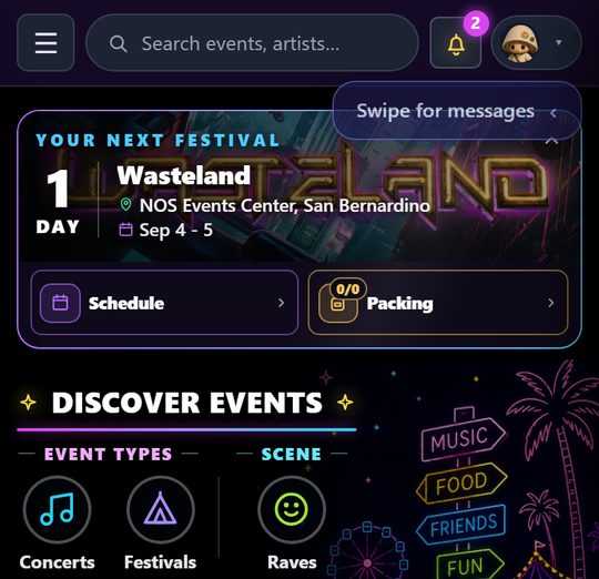
Once it starts the banner switches into festival mode and stops counting down, because the countdown is over and it would just be noise. Instead it reads DAY 1 OF 4, ticking up each day and finishing on FINAL DAY. A one night show says TODAY, then LIVE NOW once doors open. The background becomes a live sky scene that is bright and sunlit during the day and turns to stars and a crescent moon at night, following the venue's local time rather than yours.
A festival day is counted the way you live it, not the way a calendar does. Gates open around midday and the last set finishes long after midnight, so 1am on Saturday is still Friday as far as the banner is concerned, it will not roll over to the next day while a headliner is still on stage. And in the small hours before the festival opens at all, it does not pretend to be under way: it reads STARTS 11 AM (or just STARTS TODAY when the listing gives no time) under a daylit sky, because the day ahead of you starts in the morning.
The tiles swap too, from planning to being there: Schedule stays on the left, and Map with the live pin count takes the right. On the day, Schedule opens your sets for today as a timeline, not the whole grid. Standing in a field, the question is what you are doing next, not what all seven stages are doing. It opens on today and carries day chips, today's is marked with a dot, so you can look ahead to tomorrow without leaving the field you are standing in. Edit brings the full grid back if you want to change something, picks save as you tap them, and Done returns you to the timeline. If you have not checked in yet, the banner says so and offers to do it in one tap. Everything you needed last week is gone, and everything you need standing in the field is one tap away.
Small daily goals pay XP and Trinkets for things you were doing anyway. Opening the app on consecutive days builds a streak, and the streak pays eggs at 7, 14, 21 and 28 days. Full detail lives in the Oasis.
Your VYBE card (your Mochi, the quote of the hour, friends online, your streak, daily quests and your XP bar) greets you once a day when you open the app: a quick popup over the feed with the day's login XP filling the bar. Close it with a tap and the feed behind it is untouched.
Swipe left from Home, or tap the Social pill at the top, and Home slides away as your friends and messages slide in beside it, one connected page. Swipe back, or tap Home, and you are exactly where you were. There is also a messages button in the header, which is the way in on a desktop where there is nothing to swipe; press Escape to close it again.
The search box across the top of that surface finds people by username, and the button beside it holds your friend requests, with a badge when someone is waiting on you.
On a phone, Home also has a chat icon in the top bar, next to the bell. A red number on it means messages are waiting, and tapping it opens the same place the swipe does.
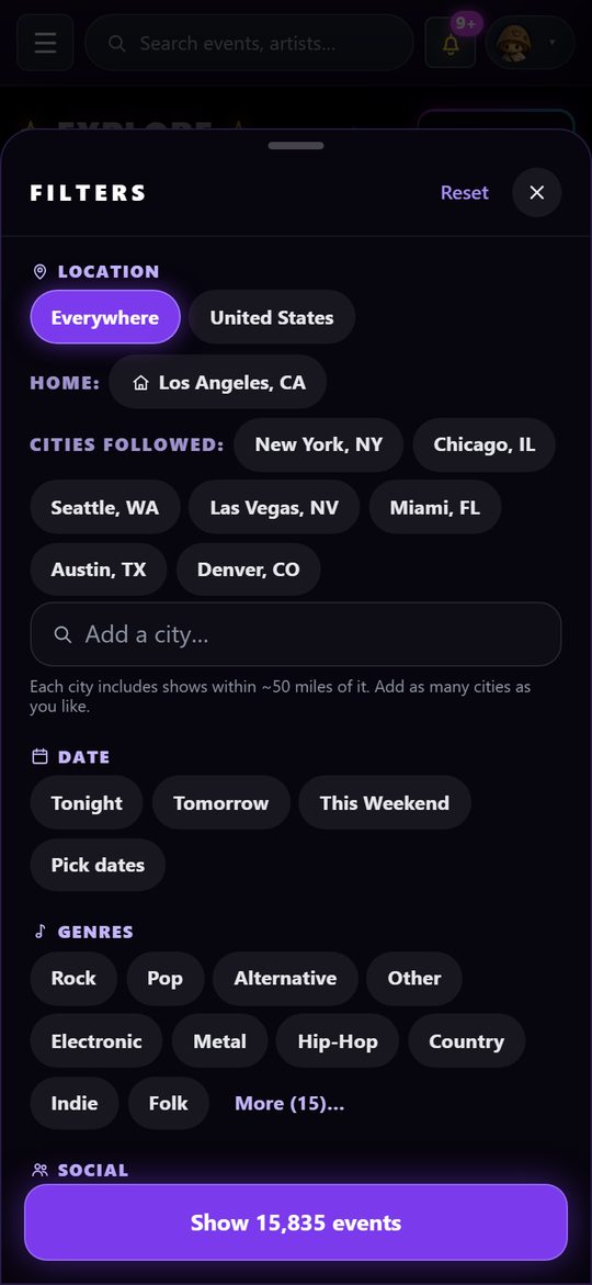
For when you know what you want. Home is opinionated; this is the whole catalog with the opinions switched off.
Everything VYBE knows about is in here. The job of the page is to let you cut it down to the night you care about.
The filter button is the heart of Explore. Stack as many as you like, and the button at the bottom counts what is left as you go, so you always know whether you are narrowing or wiping out your results.
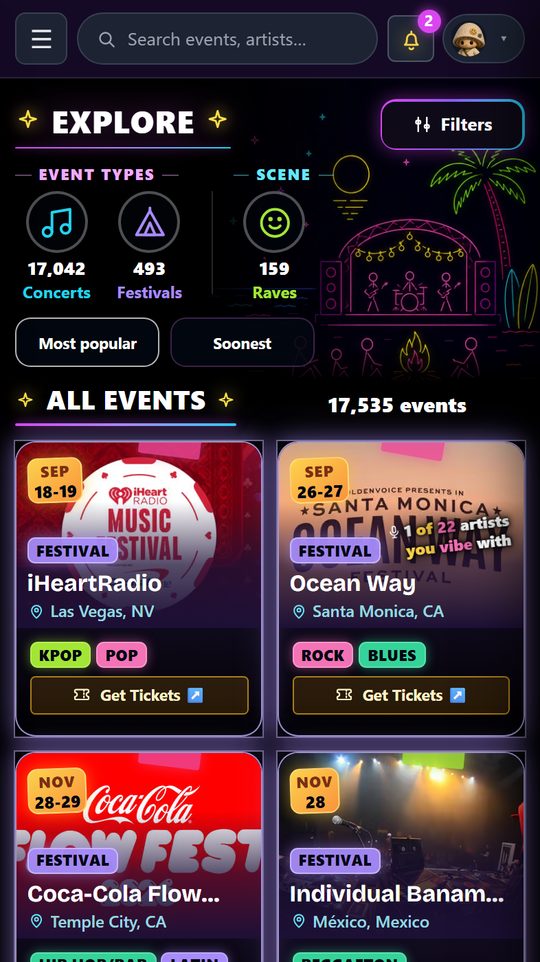
Above the results sits a shorter row for the two things you change constantly: your city, and the sort. Most popular leads with the biggest festivals and then the concerts, each ranked by the most popular artist on its lineup, so the headliners you have actually heard of come first. Soonest is plain chronological. Anything you switch on in the filter sheet also appears here as a chip you can tap to clear.
The header search covers artists, events and venues at once. Searching an artist gets you their page and every date of theirs we know about; searching a venue gets you everything on its calendar. Artist rows in the dropdown carry a + Follow button on the right, the same one the lineup uses, so you can follow straight from the search without opening the page; it reads Following once you do. Event rows show the event type as a small badge under the title.
The single fastest way to make the feed yours. Follow someone and you stop missing their shows, permanently.
Artists are not just names on a lineup here. Tap any artist name anywhere in the app and their page opens.
Follow an artist and two things happen. Their shows start surfacing in your Home feed, and you get an alert when they announce a date near you or turn up on a lineup you are already watching.
Home also has an Artists on tour near you row. It shows tour stops for the artists you follow within about 100 miles of your city or any city you follow, over the next six months. If you follow nobody yet, or none of them come close, the row says so, with a link to follow more artists and one to follow more cities, since both decide what shows up.
An artist page shows who they are, their genres, and every date of theirs VYBE knows about, listed under month headings, so you can see the whole run at once and pick the city that works for you. When we know a show's price, the date carries it: the GA pass by name, or “from $X”. Their festival appearances are in there too, which is often how you find out a name you love is buried on day two of something you were ignoring.
Dates come from ticket sellers and also from the artist's own website when it publishes a tour list, so a show often turns up as soon as it is announced, even while tickets are still a waitlist. For those, the ticket button opens the artist's own page for the show until a ticket seller lists it.
Everything that hangs off a single show: the event card and all of its panels, the Festival Map, checking in, your calendar, crews, and the constellation those events build over time.
The most important screen in the app. Nearly everything VYBE does either leads you to an event card or lives inside one.
Deciding whether to go to a show normally means a ticket site for the price, a lineup poster somewhere else, a weather app, a group chat to ask who else is in, and a festival PDF you cannot read on a phone. The event card is all of that on one screen, and it keeps working once you are actually there.
The pills across the top read Lineup · Info · Schedule, and you swipe sideways between them. The card opens on Info. Here is what is in each part.
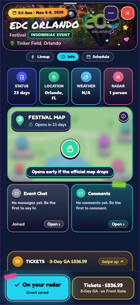
The full bill, with the artists that are yours highlighted, so a festival poster with 40 names on it becomes legible in about two seconds. Every name is tappable and opens that artist.
For a festival that runs every year, the Lineup panel also carries a drop calendar: when this festival announced its lineup, its day splits and its set times, and roughly when it will do it again. It is built from the festival's own history rather than a guess, so it tells you how many years it is going on and says plainly when it does not know yet. An event that only happens once has no next year, so it does not appear there.
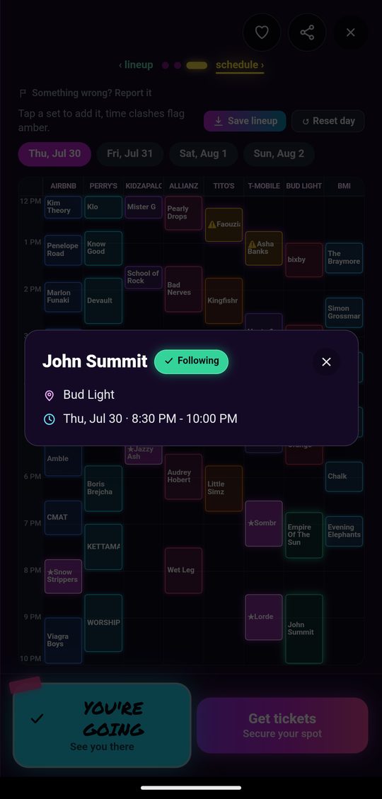
For festivals we have schedule data on, swipe to the Schedule panel and you get the whole day at once. Stages run across the top as columns, time runs down the left, and every set is a block sized to its real length, so two things happening at 8pm are physically side by side. Each stage column gets its own neon color, and the whole day is fit to one screen with no scrolling, which is why the text gets small on a packed day. Tabs at the top switch between festival days.
A big festival has more stages than fit on a phone. The grid shows the seven biggest as columns and collects the rest behind a +N tab in the header. Tap it and the remaining stages open in their own sheet, with the same picking and the same colours. “Biggest” means how long the stage runs for, not how many sets it has, otherwise a side stage cycling twenty short DJ sets would push a headline stage with six long ones off the screen, which is the wrong way round. Lollapalooza runs ten stages, so the two side stages and the small one live in that sheet.
You know they are playing. You do not know which day, or which stage. The magnifier at the right end of the day tabs answers exactly that: tap it, type two letters, and it lists matching artists from this festival's lineup only, each with the day, the stage and the set time. Tap one and it jumps to that day and opens the artist. If the set times are out but that artist has no slot yet, it still says they are playing and marks the time TBA. Tap anywhere else and the box tucks itself away again.
The other answer matters just as much. If they are not on the bill, it says “No one by that name on this lineup”, which settles it, instead of leaving you scrolling seven stage columns across four days to be sure.
The first time you open a schedule, a card shows you the three things worth knowing, what a pick looks like, what a clash looks like, and what My Schedule does, using the real colours rather than describing them. It appears once and never again.
Tap any set and it fills in deep magenta, a brighter rim, a soft glow, and a little bigger than everything around it, so one glance down a column tells you what you have chosen. That is your lineup. It saves to your account the moment you tap, so it is still there the next time you open the schedule, on any device you sign in on. Tap it again to drop it. Once a day has at least one pick, the sets you passed on fade back slightly, so the day you are building stands out from the day you are browsing. Names on the grid are the promoter's billing for that set, so a DJ set or a b2b reads the way the poster wrote it, while the lineup tab lists the artists themselves.
If two sets you picked overlap in time, both turn amber with a warning icon. That is the whole point of the grid: it finds the clash for you instead of you finding it at 8pm on Saturday. Reset day clears every pick on the day you are looking at.
Every set you pick also gets you a ping 15 minutes before it starts, with the stage in it. If the festival moves that set to another time or stage, you get one more telling you where it went. Tapping either opens the schedule. Set reminders in notification settings turns them off.
The grid answers “what is on at 4pm”. My Schedule, top left once you have picked something, answers a different question: what is my day. Your picks become a single timeline, in order, each one showing its time, the artist and the stage.
The useful part is what sits between them. Every gap is its own row, labelled with how long it is, 3h gap, 30m gap, and drawn to scale. A three-hour hole is six times the height of a thirty-minute one, so you feel the shape of your day before you read a single number. That is the thing you actually plan around: whether there is time to eat, to walk to the far stage, to sit down for a while. The footer counts your sets and how many hours of music that adds up to, and you can switch days the same way you do on the grid, the panel itself stays put while the day changes inside it.
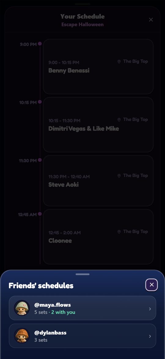
Friends' schedules sits at the bottom of My Schedule, with a count of how many of your friends have picked sets for that festival. Tap it and they slide up in a list, the ones you share the most sets with first, each showing how many sets they picked and how many of those are with you. Tap a friend and their picks land on the grid next to yours, the same view a schedule sent in a chat opens. Nobody has to send you anything first. Friends who hide their upcoming plans in privacy settings stay off the list.
Your schedule goes out from a chat, not from the schedule itself. The + beside the message box in a DM, a crew chat or an event chat has Send schedule. In a crew or an event chat it sends your picks for that room's event. In a DM you choose which event, from the list of ones you have picked sets for. It lands as a card; whoever taps it sees your picks laid over the grid next to their own, yours in pink, theirs in blue, a set you both chose in green, colour alone saying whose. The legend is the filter: Both by default, or tap one name to see that person's picks on their own, and a See schedule button up beside the title, in that person's colour, opens their day as a timeline with its gaps, pink for yours and blue for theirs. The magnifier finds an artist on the lineup and tucks itself away again when you tap anywhere else. Swipe right from the left edge to get back to the chat. Sending it again replaces the old card instead of stacking another.
Any set by an artist you follow, or that your connected music service says you already listen to, carries a green ring and glow. The ones you have starred as favorites go further and carry a gold ring and glow instead. You do not have to hunt a 183-name poster for the names you know. They light themselves up, and the handful you would queue an hour for light up brightest.
Gold means exactly one thing here. A clash keeps the pink of a pick and wears an orange ring and a warning sign, because a clash is always a set you picked. The fill tells you whose it is, the ring tells you what is wrong with it.
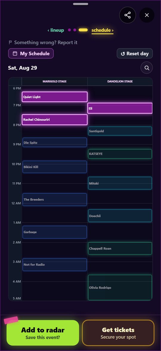
The blocks are narrow, so long names get cut off. Press and hold any set for about half a second and a card opens with the artist's full name, the stage they are on, the day, and the exact start and end time. From that card you can follow them right there, which immediately turns their other sets green. A normal tap still just picks the set, and sliding your finger cancels the hold, so panning around the schedule never accidentally opens it.
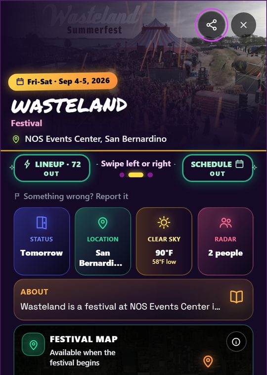
A weather tile appears on the card as the date gets close, showing the condition and the high and low for the event's actual location. It sits in the row of glance tiles on the card's first panel, between Location and Radar.
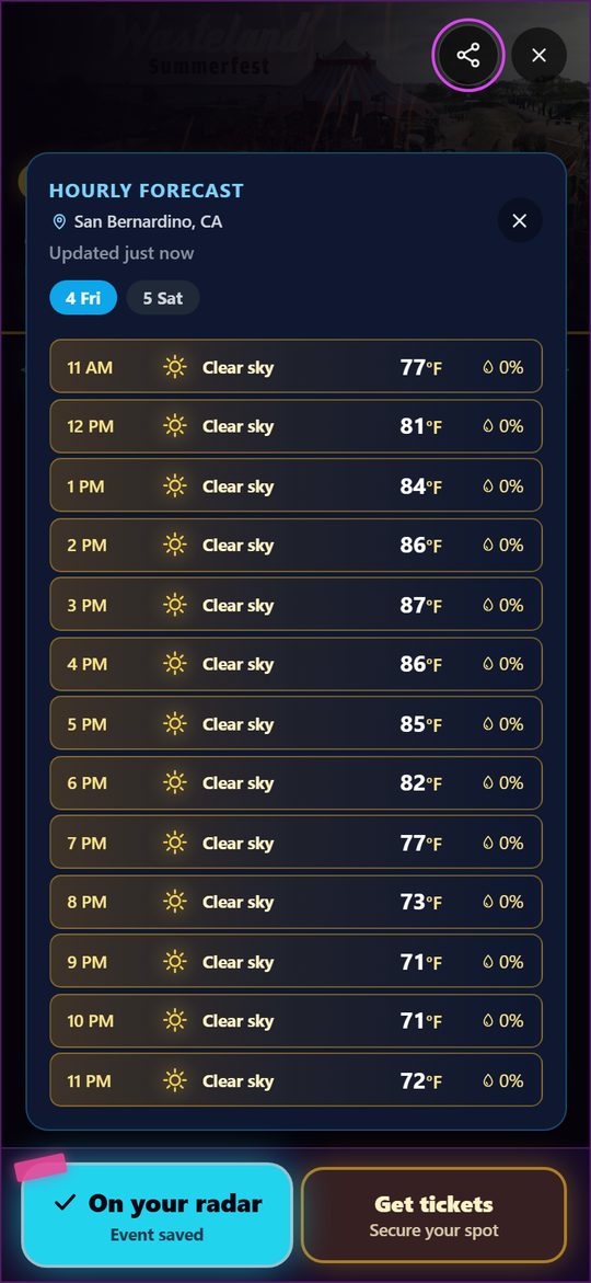
Tap that tile and it opens the hourly forecast, with a tab per festival day. For a concert it shows the few hours around showtime, in the venue's own time. The date it covers sits at the top. The tile does not look like a button, but it is one.
It also keeps itself current rather than freezing at whatever it said the first time someone opened the event. Weather moves, and it moves most in the last few days before a festival, which is exactly when you are deciding what to pack. The forecast refreshes on its own about every hour, tells you how old the reading is, and gets meaningfully more accurate as the date approaches. There is more on that just below.
Every hour is coloured by its condition, so you can see a wet afternoon or a brutal one without reading a single number: yellow for clear, pale blue for drizzle, deep blue for rain, violet for storms, grey for overcast. Each row also carries the chance of rain for that hour.
Under the Festival Map, Event Chat and Comments sit side by side as two square tiles. The Event Chat tile previews the last thing someone said there. Tap it and the card closes and the room opens. Every event has one, a public chat for everyone with the show on their radar, and it is the fastest way to find out who else is heading there. The full story is in the Event Chats section below.
Questions and tips from other people going. Is the venue cashless, can you leave and come back in, how bad is parking. The Comments tile shows the top comment, and tapping it opens the rest. It is the part most likely to save you an hour on the day.
Add to radar and Get tickets stay pinned at the bottom of the card. The ticket button quotes the whole-event GA price by its pass name and says who sells it, like “Tickets · $336.99 / 3-Day GA · on Front Gate”. When the only link we have is a listing page that shows the event but sells nothing, the button says Ticket info instead, so you know before you tap. Every ticket link also says who sells there: Official is the primary seller, like Front Gate or Ticketmaster, and Resale is a site where fans resell their tickets, named, like “Resale · SeatGeek”. A site we don't recognize gets no label. That tells you where the link goes. It doesn't mean we checked the tickets.
Rising from those two buttons is the Tickets tab, which tells you the one thing that matters right now: a countdown, a sell out or the price. Swipe up on the card, or tap the tab, and the card turns to its Tickets page, the same way swiping sideways turns to Lineup or Schedule. A Swipe down for event info pill sits at the top of that page; swipe down or tap it to go back. When a seller shares no prices (Ticketmaster and AXS keep them to themselves), a card says so and what we do know, like when the sale opens.
The page fits on one screen. The big Now tile shows what the pass costs right now with fees, and the yellow pill inside it names the pass. It opens on general admission for the whole event; tap the pill to pick another. The two smaller tiles beside it say how much the price has moved since we started tracking and where it goes next. Sellers never publish the next tier's price, so Next jump shows what the same pass did next at this point last year. With no last year to go on, Next tier guesses from the step between the last two tiers, and with neither it shows the Lowest seen. Under the tiles, Updated 2h ago says how fresh the prices are.
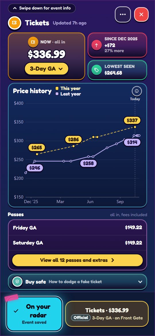
Below that is the Price history chart. It works like flight price tracking: prices up the left side, months along the bottom, and the price written on a small pill at every point where it changed, fees included. Yellow is this year. For festivals we can find last year's sale for, a purple line shows the same pass at the same number of days before last year's show, and it runs past Today, so you can see where the price went from here last time. When both lines are there, small coloured squares key them. A solid line means the price changed on that exact day; a dashed one means it changed somewhere between two days. The ⓘ on the chart shows a sample with each mark explained.
Under the chart are two passes, and View all passes and extras (it counts them) opens a sheet with every pass grouped into General admission, GA+, VIP, and Camping & travel. Each pass is a tile with its price, add-ons read like “+ 3D Collectible Magnet +$10”, and earlier tiers that sold out are struck through. Swipe down to close it. Under the passes, Buy safe opens four quick rules for not getting stuck with a fake ticket. It stays one line until you tap it, so the chart keeps its room.
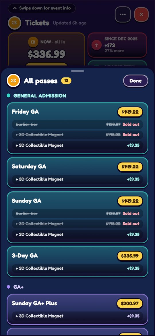
Prices show only when the seller publishes one, and many do not. Festivals that sell through Front Gate (EDC, Escape, BOO and many more) show every pass and price tier straight from the seller, face value plus fees. Each price step on the chart is a tier selling out and the next one taking over. Always confirm on the seller's page before you buy. Your own list of every show's tickets lives in My Events.
The ⋯ button next to the ✕ opens a small menu: Send to a friend shares the event in a chat, and Report a problem asks whether the event, its lineup or its schedule is wrong. Wrong date, wrong venue, dead ticket link, duplicate listing. It goes straight to us.
The part VYBE is built around. Official maps show you the stages; this shows you what only the people standing there know.
The Festival Map is a panel on the event card, and it is the feature VYBE is really built around. Official festival apps show you where the stages are. The Festival Map shows you what only people standing there know: which vendor gives out free water, where cell service actually works, which restrooms have no line, where the shade is at 3pm.
It is a map of the venue that attendees build together during the event, and it resets for each one.
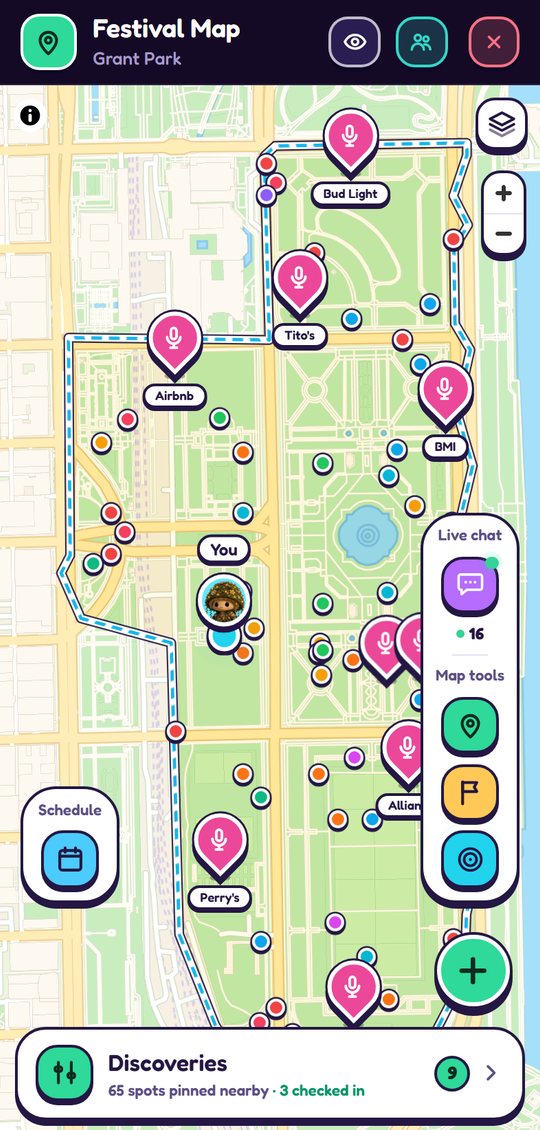
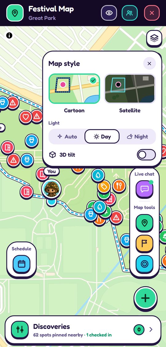
The map opens in Cartoon: a flat, colored in drawing of the venue with green parks, blue water and cream roads. It follows the sun at the venue, bright by day and a deep purple after sunset, so it never glares at you in the dark. The layers button in the top right corner switches to Satellite, the real photo of the ground, which is handy when you want to see the actual tents and stages. The same panel lets you pin the cartoon to Day or Night and turn on 3D tilt, which leans the map back so the buildings stand up. Your pick is remembered on your phone.
Where we hold a festival's official site map, its boundary is on ours. The ground inside the fence is lit and outlined; everything outside dims back. Open the map and it frames the whole site, so before you read a single label you know how big this place is and where it ends, which is the first thing you want when you are standing at a gate on day one.
This layer is not built by the crowd and carries no confidence score, because it is the promoter's own line rather than anybody's guess. Lollapalooza is the first one in: Grant Park from Monroe down to Roosevelt, Michigan Avenue to Lake Shore Drive, with the Art Institute block left out because the official map leaves it outside the fence. It is attached to the venue, so every future Lollapalooza in Grant Park inherits it without anyone redrawing it, and Lollapalooza Berlin, being a different park, correctly gets nothing.
The same layer carries the things you navigate by. Stages are named on the map from the first frame, because that is how anyone actually gives directions at a festival, “meet me by Perry's” beats any set of coordinates. Zoom in and the gates appear in green, each named the way your ticket names it: North, Premium, Main, Suites, Cabana, Platinum. Zoom further and the emergency exits show in red, they stay hidden at whole site zoom because twelve red dots over the whole park is noise, and the moment you want one you are looking at your own corner of the map anyway.
Keep zooming and the rest of the official map arrives: the food courts and bars by name, the lounges, merch, restrooms, hydration stations, charging, cooling, lockers, guest services, wristband help, ASL, Rock & Recycle and Lost & Found. Around ninety points in all, which is why they arrive in layers rather than at once, the things you steer by first, then the ones you go looking for.
Camping festivals can get a second outline. Where the promoter publishes a camping map, the campground is drawn in green next to the cyan festival fence, with the camping zones named the way the map names them, so “we're in Crescent Cove” means something on the first night.
Each pin is a circle carrying its category's icon in that category's color, so you can read the ground without tapping anything: cyan is water, blue is restrooms, orange is food, green is a decompress zone, amber is merch. Stages stand up as tall pink pins with their names underneath. On the cartoon map, when you are zoomed out to the whole site, the smaller pins shrink to dots in their color so the stages stay readable; pinch in and they turn back into full pins. Pins with a small padlock badge are your own private ones. On the cartoon map your Mochi's head marks the spot where you are, once your phone shares its location with the map, and friends sharing their location show up the same way. The eye button in the header, left of the friends button, hides every pin so you can read the bare map; tap it again to bring them back. Pinch to zoom, drag to pan, and the buttons on the right side of the map recenter you: the green pin snaps back to the festival, the cyan target jumps to where you are standing.
Parked car · Campsite · Locker · Meeting spot · My exit · Shower · Go-to restroom
Personal pins never appear to anyone else, ever. They can go anywhere, outside the grounds too, and any day, not just while the festival is on. Dropping one where you parked is the single most useful thing you can do at 11am on day one.
The green + button arms placement. A banner tells you to tap the map where your pin goes, or you can hit Pin my location and it uses your GPS instead of your aim, which is what you want when you are standing right at your car. Then you pick one of the personal categories, give it a title, and add an optional note. The pin is yours alone.
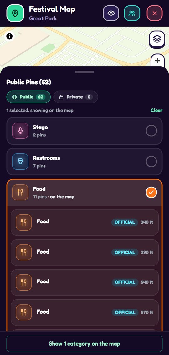
Tap the Discoveries bar across the top of the map and you get everything on it as a list, which is faster than hunting pins when you want a specific thing. Across the top, Public / Private with live counts, Public is the default, Private is your own pins. Below that, every category is its own card, collapsed to a name and a count, with a round checkbox on the right. Tap a card to select it: the checkbox fills in, the card takes the category's color, and its pins list underneath. Pick as many categories as you like, Restrooms and Water at once is the usual one, and tap a card again to take it off. The button at the bottom reads Show 2 categories on the map so you know what closing the list will do. Inside each card the nearest pins lead, the question on the grounds is always "which one is closest", and until the map knows where you are, the most confirmed ones lead instead.
Every row leads with the pin's name and category, when it was added or last confirmed, and its comment count. On the right sits an Official, Public or Private chip with your distance, and the row's top corner carries the trust icon: a blue circled check for Community verified, a sparkle for a new discovery, a warning triangle when a pin is contested or disputed. Tap a row to fly the map to that pin and open it.
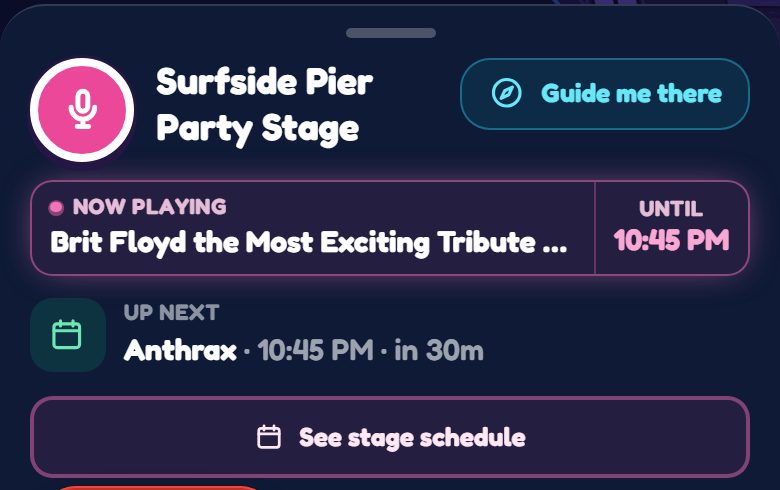
Stage pins never need the filter. Every stage wears its name below the pin and, during the festival, who is on above it: a blinking live dot with the current act, or Next: and the upcoming one between sets. Zoomed to the grounds, the map reads like a live lineup poster.
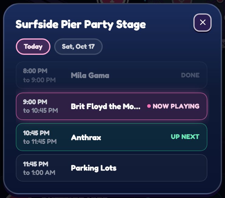
Tap a stage pin and its card has See stage schedule. It opens that stage's day: every set in order, the one playing now lit up, the next one marked Up next, and the earlier ones faded, so you can see where the stage is at a glance. Day chips at the top switch to the other days.
Nearest, at the bottom of the map, opens five buttons: Restroom, Bar, Food, Exit and Emergency exit. One tap guides you to the closest one; a dimmed button means this map has no pin of that kind yet. Every pin's card also has Guide me there: it draws a straight dotted line from you to the pin, an arrow on your dot pointing the way, and a live distance up top ("850 ft"). The map itself stays put, north-up. While guiding, your Mochi steps off your dot and a white tick shows which way you are facing: line it up with the arrow and you are walking the right way. The map also clears the deck: the buttons and bars step away, and every pin except your destination fades back, so the whole route reads at a glance, it all returns the moment you stop. Your You are here dot is live the whole time the map is open, it appears on its own and walks with you, no button needed, and the tracking stops the moment the map closes. Guiding is a straight line on purpose rather than road routing: inside a fenced festival ground, a heading and a distance are the honest directions.
The map also carries your day: the calendar button on the left opens the same My Schedule popup as the Home banner's tile, day chips, your picks to scale, and Edit to change them. From any schedule (here or on Home), tapping a set jumps the map to that set's stage pin, where Guide me there is one tap away.
Open one and the card keeps it short: the trust badge, when the pin was posted, the note, and the top comment. Tap View all comments to read the rest and add your own, the comment box lives in there. Below that, Is this location correct? with a Yes/No vote keeps the map honest. Guide me there sits at the card's top right, and Report at the bottom.
Once you have voted, the two circles fold into one quiet line saying which way you went. Tap Change to reopen them and switch, or tap your standing answer again to take the vote back entirely. Nothing you vote is locked in.
Official pins from the promoter's map carry no badge and no Yes/No vote, because the promoter's own line needs no vouching. If one of them is wrong, that is what Something wrong? Report at the foot of the card is for, and those reports go straight to our review queue.
Preloaded official pins come from the promoter's own site map, and most promoters only release that a few days before the show. A map can be empty early and fill in late, and some events never get an official layer at all. Your own pins work either way, so you can still mark your car, your campsite and your meetup spot.
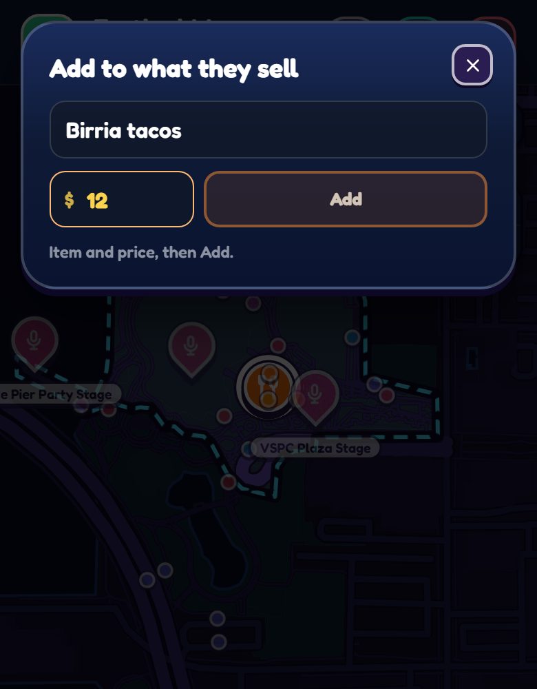
Food, bar and merch pins can optionally carry a menu: item names and prices, added by attendees standing at the counter. For a bar that means the drink list, which answers the only question that matters before you commit to the line. It is text rather than photos on purpose, because a typed line is quick to correct and quick to moderate. Nobody is expected to enter a whole menu. Three items and their prices is genuinely useful, because the thing people want to know is whether it is a $9 taco place or an $18 one before they walk across the field. The list sorts by price (cheapest first by default), and every item someone else added wears a small flag, reporting an item hides it for you right away, and a second reporter removes it for everyone.
To see every menu at once, tap Menus under Schedule on the left of the map. It lists every food and drink item at the festival. Pick Food or Drinks at the top, then narrow it down: food by cuisine (Mexican, American, Asian and so on) and drinks by alcoholic or non-alcoholic, so you can compare the three places selling tacos without opening each pin. Merch stands are left out, since this is a menu. Each item shows its price, the vendor selling it and how many feet away that vendor is, and you can search or sort by nearest or cheapest. Tap an item and the map takes you to that vendor.
Every item needs its price, because the price is the whole point. You add items from the pin itself, which is handy when you buy something on day two: tap Add an item under the list and a small box opens at the top of the screen with the item and price fields. Type the item, press return to jump to the price, and return again (or Add) adds it. The box stays open for the next one; close it when you are done. This works on the promoter's official food and merch pins too, not just community ones, the stand is official, but what it sells and what it costs still comes from the people standing in line.
A packed festival is the one place with no usable reception, and also the one place this map is supposed to earn its keep. So the map is saved to your phone.
VYBE keeps a copy of the map for events you are Going to, in the background, while you still have signal. You do not have to remember to do anything. If you open the map with no service, you get the saved copy, plus a notice telling you exactly how old it is (“as it was 3 hours ago”), and a banner that stays up the whole time so you never forget you are looking at a snapshot. It refreshes by itself the moment your signal comes back.
One bar is handled the same way. When your connection is too weak or the live map is taking more than a few seconds, the map does not sit on a spinner: it opens the saved copy at once and tells you why, and Try again on that notice forces a fresh load whenever you want one.
The friends button at the top of the map opens Your crew: everyone in your crew for this event, with how long ago their spot was taken and whether they have checked in. Tap someone to jump to them and get Guide me there, or tap the eye to hide them from your map (everyone shows by default). Share my spot up there turns your own sharing on; your friends and your crew see it, nobody else, and it refreshes every time you open the app.
Your friends and crew are covered too. Friends who share their spot stay on the map where you last saw them, and once a spot is a few minutes old its dot wears its age, like 12m, so you know it is where they were. If you host a crew, tap +, drop the pin where you meet and choose Make it your crew's meetup spot: everyone in the crew sees a cyan friends badge on the map, it is listed first in Discoveries, and tapping it shows the spot with Guide me there, signal or not. Only the host can place it or remove it. And a message you send in a crew or event chat with no signal waits on your phone as Waiting for signal and sends itself when you are back, in the order you wrote it.
The Discoveries bar at the top of the map carries a live count of how many VYBE users have checked in at this event. It is a rough read on how full the grounds are and how much of the map you can trust to be current.
Each event map has a live chat, newest messages first, with a live indicator and how long ago each message was sent. Only people who have checked in at the event can post. Anyone can read it. That single rule is what keeps it a conversation between people on the same field instead of a comment section.
The friends button in the map's header shares your spot. It is friends only, off by default, turned on per event, and you can turn it off at any time by tapping the same button. The first tap opens a popup that says exactly what it does before anything is shared. Friends who have also turned it on appear as their Mochi on the map. It is for finding each other in a crowd, and it stops when the event does. Nobody outside your friends can see it, and it is completely separate from pins: dropping a pin never reveals where you are.
It also refuses to work more than about 10 km from the venue, expires on its own within hours, and shows friends where you last were rather than tracking you live. The full rules are in section 6.1.
One tap that unlocks the map, the live chat, and a verified star on your constellation.
Checking in is the key that unlocks the Festival Map, and it is the app's proof that you were somewhere. When you are physically at an event during its window, tap Check in from the event page or the Home banner. VYBE reads your location once to confirm you are inside the venue area, and that is it. No background tracking.
Two things have to be true: you have to be inside the venue's area, and it has to be during the event's window, which opens a few hours before doors and stays open into the night after, because plenty of people only remember on the ride home. Miss either one and nothing is stored, and the app tells you which one you missed rather than just failing.
Checking in:
It is the single most important tap in the app, because almost everything that has to be trustworthy is gated behind it. That is deliberate: a map and a live chat are only worth anything if the people using them were actually there.
Your plans, your history, and your friends’ nights, on one month at a glance.
My Events, under You in the menu, opens on the Calendar: your whole life in live music on one screen, what you have committed to, what you are thinking about, what you have already been to, and what your friends are doing on the same nights.
Constellation, Calendar and Spending are one page with pills across the top. From the Calendar, swipe right for your Constellation and left for Spending, or tap a pill to jump straight there. A swipe on the month grid itself still changes the month. Tickets sits below the Calendar, as a tab at the bottom of the screen.
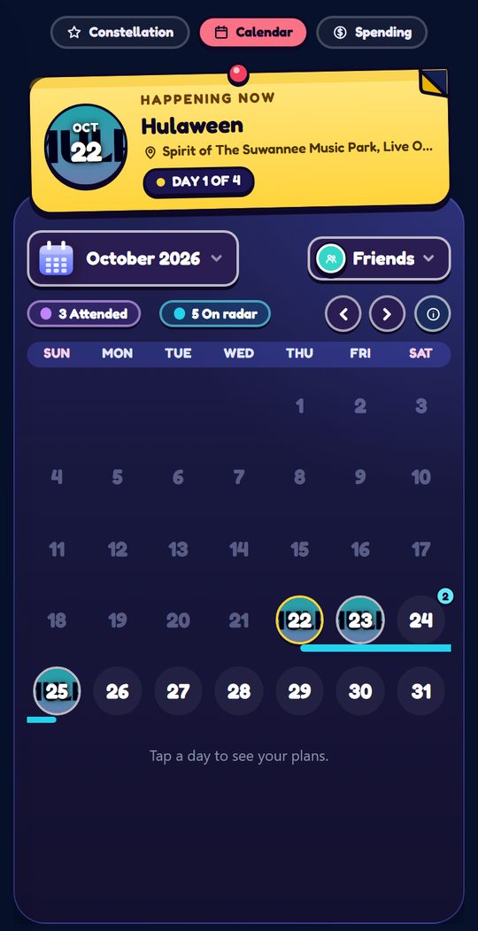
Your next event is a yellow sticky note pinned to the top of the calendar: the event's photo with its date, the name and place, and how many days to go. On the day itself it says what is happening now instead, like Day 1 of 4. Tap the note to open the event.
Under the month name sit two chips, Attended and On radar, each with its count, and each opens its list. They double as the calendar's legend: their colors are the colors of the dots on the grid. The month arrows sit beside them. My Events has no app header so the calendar gets the room; swipe right from the left edge for the menu.
Each day carries a small dot per event in that state's color, so a glance down the month tells you where your busy weeks are. Festivals that run several days draw as a bar spanning their whole run rather than as separate dots, which is how a four-day Lollapalooza reads as one thing instead of four. Arrows on either edge move month to month and so does a sideways swipe, tapping the month name jumps straight to any other one, and tapping a day opens that day's plans underneath. A day with one of your events shows that event's picture in its circle, so you can tell what it is before you tap. A day with two or more wears a small count badge instead.
When the day has plans, the month folds down to that week so its events get the room, and Show month unfolds it and closes the day. The day panel shows one event at a time, yours or one on a friend's radar, and its header says 3 events when there is more than one: swipe up or down to move between them. Those swipes stay inside the panel and never open Tickets by accident.
The Friends picker next to the month is the part people miss. Open it, pick one friend or several, and the calendar redraws as their plans overlaid on yours, so you can see the nights you are both free, or already both going. Clear the picks to go back to just you.
One rule: a show lands in Attended when you checked in at it. Put it on your radar so the Home banner offers Check in on the day, tap it at the venue, and the list builds itself. Each row says what you spent there, $240 spent, or Spent N/A if you never logged it, and carries the community's reviews: tap Read reviews on any row.
The tab at the bottom of the Calendar shows the next sale to open across your radar with a countdown, or how many of your shows are on sale or sold out when nothing is about to drop. Swipe up or tap it and the Tickets list opens as one amber panel: every upcoming show on your radar, grouped by what its tickets are doing. Dropping soon counts down to the presale or general sale, then come Sold out, On sale, and No ticket info yet. Each row is a ticket stub quoting the whole-event GA price by pass name, or GA N/A when the seller shares none. Tap a row and the event card opens straight on its Tickets page.
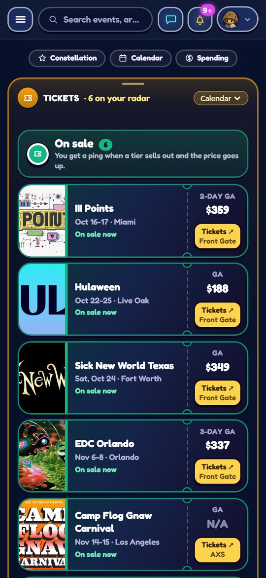
Your radar is your watch list, there is nothing else to switch on. For every show on it we check the tickets about once a day and ping you when tickets drop or a sale opens, and when a tier sells out and the price goes up or the whole thing sells out. Mute these under Tickets & on-sale in your notification settings.
Optionally record what a show actually cost you: tickets, travel, the lot. It adds up on the Spending page, one swipe left from the Calendar, and it is the only honest way to answer “how much do I spend on this”. Section 5.1 has the detail.
Where “we should go to that” turns into an actual plan with a meetup time and someone bringing the ice.
A crew is a planning room attached to one event, created from the calendar or the event itself. Anyone you invite can join. It exists because the gap between “we should go” and actually going is almost always logistics, not enthusiasm.
The room is headed by the event itself, photo, name, date and city, with an arrow straight back to the full event card, so nobody has to go looking for the thing you are all planning around. Under that, the crew strip: how many of you there are, everyone's Mochi, a button to add people, and the room menu. Three tabs run the rest.
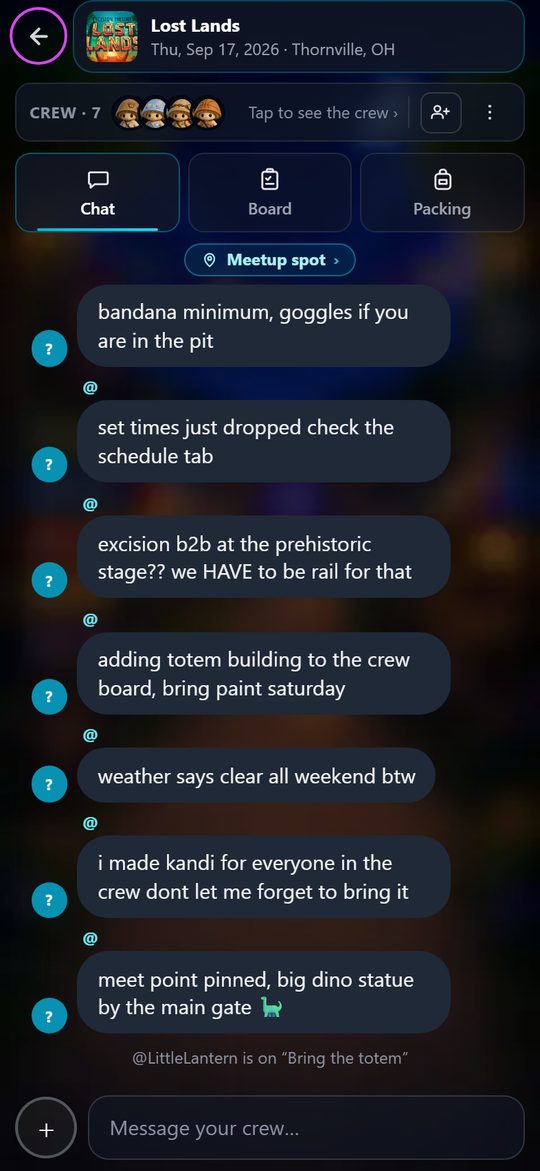
Group chat with typing indicators, on a blurred picture of the crew's scene, the one the host picked. On the Social page that scene shows the crew standing together, up to seven Mochis with a handle under each pair of feet (yours says You; anyone past seven counts in a +N pill), and the room's last line sits above them as one speech bubble. Tap it and the room opens. Your messages are on the right, everyone else's are dark on the left with their handle and Mochi. What makes it a planning room rather than a group text is that the room narrates itself: when someone joins, when the meetup spot is set, when a person claims a responsibility, that appears inline as a quiet system line. You can reconstruct the whole plan by scrolling once, instead of asking “so who is bringing the tent” for the fourth time.
Type @ and a few letters to mention someone: a list of the people in that room fills in as you type, tap one and their handle drops in. A line that mentions you wears an amber ring, and if you are not in the room at the time you get one notification, never more than one every ten minutes for the same room, so a busy chat cannot spam you. Hold any message and pick Reply to quote it above your own; the person you reply to counts as mentioned.
The Meetup spot is pinned above the conversation, so the single most important logistical fact is never buried. The host sets a place and a time window, and it can be your current location, which is what you want once you are already there.
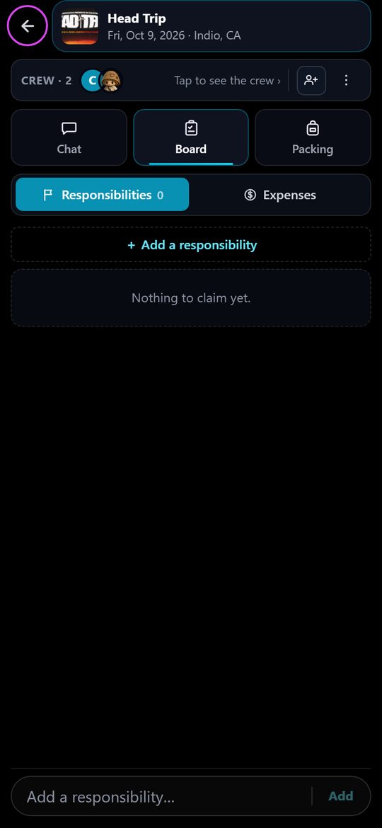
The shared plan, split in two. A new crew starts without a Board, because most crews never need one. The host turns on Responsibilities, Expenses or both from the room menu under Board sections, and the Board tab appears beside Chat and Packing. Turning a section off hides it. Nothing in it is deleted, and it is all still there when it comes back on.
Your own packing list, private to you, with a readiness count so you can see at a glance that you are 6 of 9 packed. It is deliberately separate from Responsibilities: that one is what you owe the group, this one is what you owe yourself, and mixing them is how people forget their own charger while triumphantly bringing the ice.
A crew is the people you already know. An event chat is everyone else going to the same show.
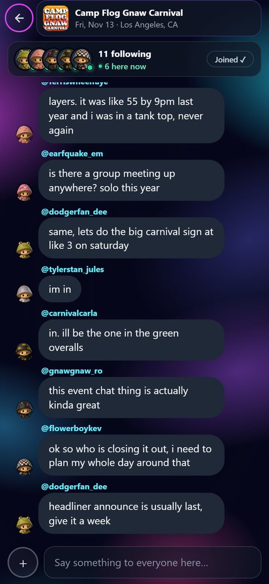
Every event has an event chat, a public chat for the people going. Anyone signed in can read it. To talk in it, put the event on your radar. That is the whole gate. There is no way to prove someone will really be there before the day, and asking for proof would kill the part that matters, which is getting hyped with strangers weeks out. On the day, people who checked in at the venue carry the verified attendee badge on their messages, so you can tell who is actually standing in the field.
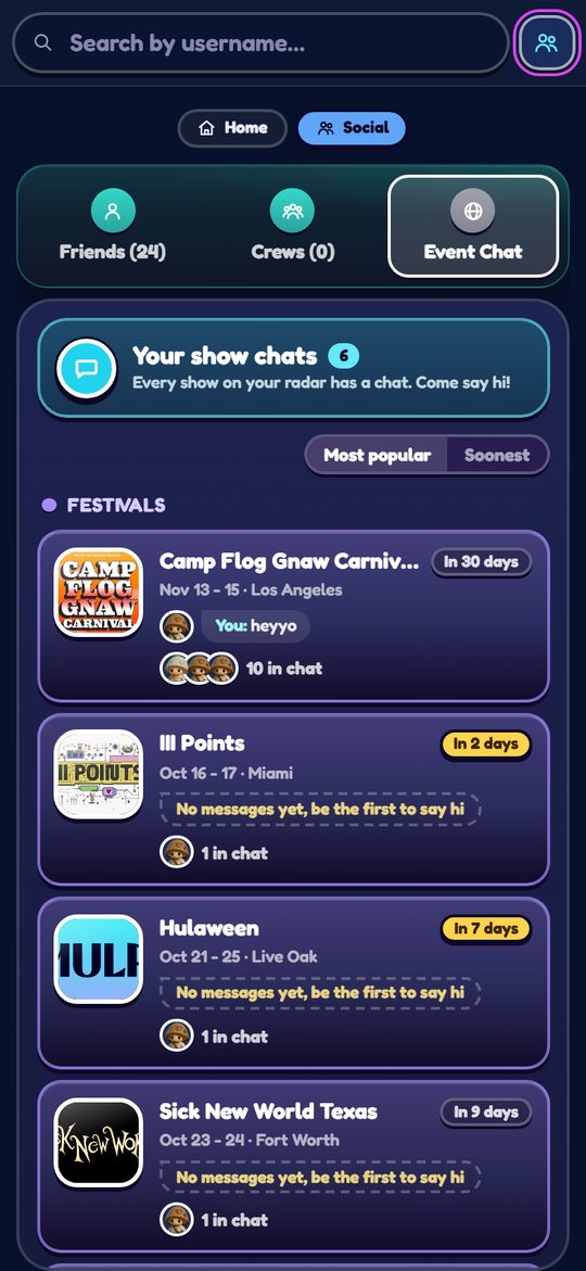
You get in three ways: the Event Chat tile under the Festival Map on the event card, which shows the last thing someone said there and opens the room in place of the card, the Event Chat tab on the Social page beside Friends and Crews, and Active Event Chats on Community, ranked by where people are actually talking. Your radar is your way in: put a show on your radar and you are in its event chat, take it off and you leave, so there is nothing to join. The Event Chat tab is Your show chats: one chat for every show on your radar, grouped into festivals, raves and concerts, with a switch between Most popular and Soonest. Each one shows the event's art, a countdown chip (Tonight, Tomorrow, In 12 days, or Happening now), the last thing someone said as a speech bubble, a few faces with “8 in chat · 2 here now”, and a pink count of what is new since you last looked. “Here now” counts other people, never you. Event chats stay quiet: you only get a ping when someone @mentions you. To peek at a chat for a show you have not added, open the event and tap Event Chat; you can read along, and adding it to your radar lets you talk. The room is there the moment anyone looks at it, and the top of every event chat says how many people are in and how many are here right now, with their Mochis in a row. Tap that row and you get everyone in the event chat with their level and rank title, and a tap on any of them opens their profile, as does a tap on any Mochi beside a message. Tap anywhere on a card to open its chat.
Inside it is the same chat as a crew room, mentions and replies included, on the same drawn scene a chat with a friend has, minus the planning tools: no board, no meetup spot, no decisions, no read receipts, and no Join or Leave button. An On your radar chip at the top says you are in; if the show is not on your radar you can read along, and the message box offers Add to radar instead. It only notifies you when someone @mentions you. A busy event chat would make you switch notifications off for the whole app, so otherwise the only signal is the pink count on its tile, which clears when you open the room. Coming and going are both quiet, nobody gets a line about it, and a new room opens empty. The room never posts a line of its own.
A public room needs guardrails, and these are on by default. Slurs are refused before they are stored, and three attempts in ten minutes mute that person in the room for an hour. Sending too fast, repeating the same line, or stuffing a message with links is refused too. Hold any message and Report it; a line that three different people report comes down for everyone, and the reports go to review. Anyone you have blocked, or who has blocked you, is not shown in the room at all.
Event Chats are per event, not per festival. Coachella gets a fresh one each year, and an event chat goes read-only two days after the event ends, same as a crew. Everyone can post at most a message every couple of seconds, the same word filter as everywhere else applies, and a person who ruins a room can be muted out of it.
The payoff. Every show you have been to, as a map of where the music has taken you.
Every show you attend becomes a star on a world map: your personal constellation of everywhere the music has taken you, with lines tracing your history between them. The more events in a city, the bigger the star. It is the payoff for everything else in this part of the app, which is why it sits right beside the calendar: swipe right from the Calendar to reach it.
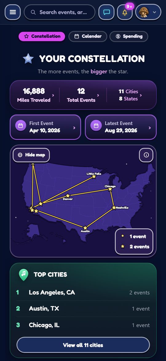
All cities opens every city you have been to in a sheet from the bottom; swipe down to close it.
The map is drawn from one list and one list only: your Attended list on the Calendar page. If a show is in there it has a star, and if you remove it from there the star goes with it. That is deliberate, so the map can never claim you went somewhere you did not.
It takes two different cities to have a constellation, not two shows: a shape needs somewhere to reach to. Five nights in one city is one star, and the map waits for the second city before it draws a line.
Your people, their plans, and the small gestures that make a festival crowd feel like a crowd you know.
Friends do not live in the left menu, because you get to them faster from Home: swipe left, or tap the Social pill at the top. Add friends by username. You will see what they are going to, get a nudge when a friend commits to a show you are eyeing, and you can plan without leaving the app.
The page has three tabs. Friends is your people and your DMs. Crews is the private planning rooms you are in. Event Chat is your show chats, the public room of every show on your radar, shared with everyone going, friend or stranger. A friend or crew circle with something unread glows until you open the chat; the tab pill and the row underneath carry the count. Event chat tiles show a pink count of new messages.
Private chat with typing indicators and read receipts, on a blurred picture of your friend's scene, the one their page shows. On the Friends tab a friend's scene shows the two of you: their Mochi on the left, yours on the right, facing each other, a small plate under each pair of feet saying who is who (their handle, and You), and the last message sits above you both as one speech bubble whose tail points at whoever spoke last. Tap it and the whole conversation opens. In every chat the message box runs to the edge of the screen and the send button appears inside it once you have typed something. Every Mochi beside a message faces the words, so a chat reads as people talking to each other. Tap a Mochi, in a DM header, a crew chat or an event chat, and that person's profile opens. Hold any message for Copy, and hold one of your own for Unsend, which takes it back for everyone in that chat.
The scene behind your messages is your background, the same one your Mochi stands on in your profile card and in the Oasis. Change it from Oasis → Customize: the stage pages through the backgrounds you own, with your actual Mochi standing in each one, so you are choosing the finished thing rather than a thumbnail. Every background has a day and a night version that swaps automatically with your local time, which is why the same choice looks like a sunlit boardwalk in the afternoon and a lantern lit one at midnight. More on backgrounds in the Oasis section.
Tap anyone's Mochi or name, wherever you see it (a review, a chat, a friends list), and their profile card pops up with their Mochi standing on the podium of their chosen chat scene, exactly as the friends list shows them, nameplate and all, day or night with the clock. Under the stage sits their bio, if they wrote one. Yours says Add a bio until you do: tap it, write up to 150 characters, and the Say Hello challenge pays out in Quests. Tap your bio later to change it. Then their stats, their top three artists each wearing its rank, top genres and songs side by side, and their constellation. See all on any taste section opens the full ranked list, top to bottom. For friends the card also shows the next event they are going to, with the event's own photo and type; tap it and the full event card opens.
Under that sits their attendance badge: the last event they verified their attendance at by checking in on site, with a See all count that opens every verified event in their history. It is the one part of a profile that cannot be faked, because a badge only exists where a live check in passed the venue's geofence during the event. Anyone can hide theirs in Settings → Privacy → Show my attendance badges.
Craft a bracelet bead by bead and gift it to a friend, the way you would at a show. Receiving one plays the PLUR handshake animation, the real one: peace, love, unity, respect. The crafter lives in the Oasis, and the reasoning behind the whole feature is in Why the app is built this way.
When somebody passes you one, a count appears on the corner of the Kandi hexagon in the Oasis. Walk in and the handshake plays by itself, showing the bracelet and who made it for you. If several people gifted you at once they queue up one after another, counted as you go, so nobody gets skipped. A generous night can leave several waiting, so Skip all opens the rest at once without performing them; the bracelets still land in your collection either way. Tapping any gifted bracelet in your collection plays the whole ritual again.
What the whole app is doing right now, and the values it is trying to hold itself to.
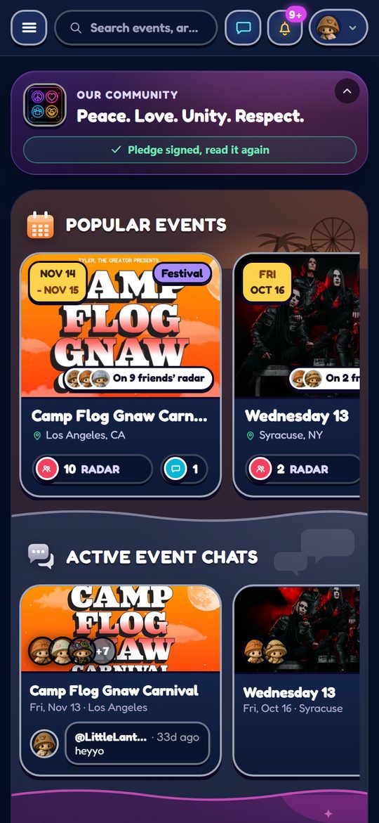
Community is two things at once: a view of what everyone on the app is doing, and the place where VYBE says out loud what it is trying to be.
The page opens with it, and it is not decoration. Peace. Love. Unity. Respect. Right under it, one button opens the pledge.
The pledge sits next to it. It is not a contract, more of a handshake: live the PLUR principles, report anyone spreading hate, help the app get better, and flag mistakes when you spot them. Signing it once earns Trinkets and XP, and you can reopen it any time.
Those two sentences are the reason for a surprising amount of how the app works. It is why the Festival Map rewards telling a stranger where the free water is. It is why pins and the live chat are gated behind actually turning up, and why the pin examples in section 3.2 are written as “would this help someone you will never meet”. A festival crowd looking after each other is the product, and the features are just the scaffolding for it.
Your identity and your progress: Financials, and then the optional half of the app.
What going out really costs you. Nothing here is public unless you allow it.
Financials is your money HQ for going out: everything you have logged, on the Spending page of My Events, private to you.
Once a date passes, the event turns up asking to be logged. It takes a minute and it is what makes everything above worth looking at:
Spending, one swipe left from the Calendar in My Events. It fits on one screen: every cost you have logged, added up over every show you have been to.
The longer lists, like every event or spending by category, open as sheets from the bottom. Swipe down to close them.
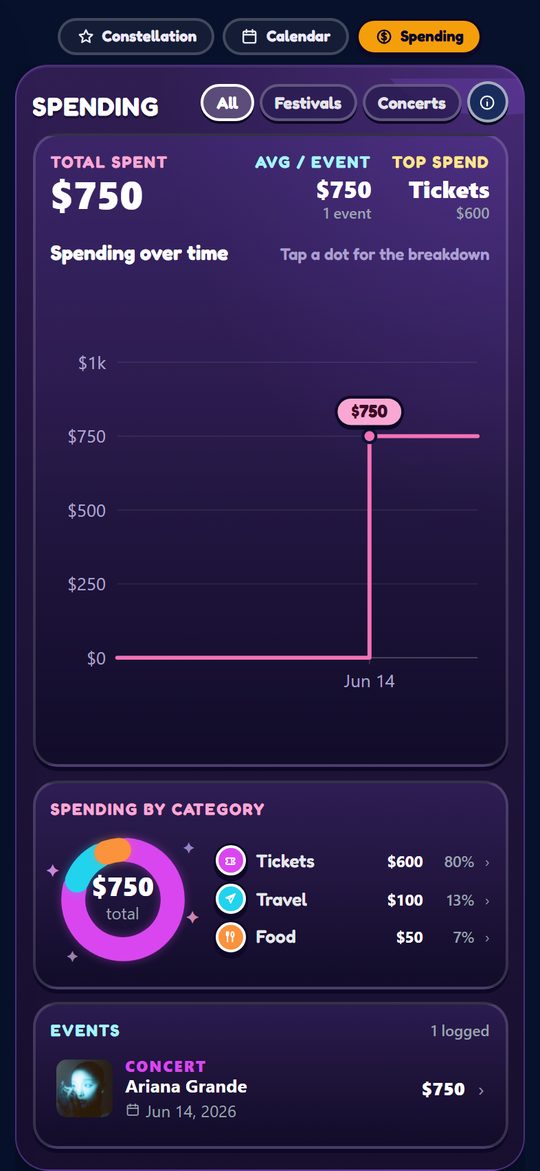
The pills up top flip the whole page between festivals, concerts or everything, and every number, the chart and the list follow along.
You can connect a music service to sharpen your feed and light up the artists you actually listen to across the app. You do not have to. Following artists and cities gives you a fully personalized feed on its own, and that path is always available.
Apple Music is the one to connect, and for now it is the only one. It takes one tap, it reads what you have on heavy rotation, what you played recently and who is in your library, and it ranks them so the artists you actually live with count for more than the ones you tried once. From then on your feed is built from real listening, and their sets glow green on festival schedules without you following anyone by hand. It syncs again quietly whenever you open the app.
Worth being straight about what Apple hands over and what it does not:
Disconnecting deletes the artists we stored from that service, not just the link.
Completely optional. Skip it and the rest of the app works exactly the same.
The Oasis is the playful layer that rewards actually going out. It is entirely optional. Skip it and the rest of the app works exactly the same. Entering it takes a moment on purpose: a little storybook doorway with a Mochi strolling under the clouds, because the Oasis is another world, not another tab.
Everything you do (saving events, going, checking in, reviewing, connecting with people) earns XP. XP raises your level, and every 5 levels unlocks a new rank title, from Little Sprout all the way to Rave Legend. Your title shows on your profile and next to your Mochi, each with its own color.
The Oasis header carries your level, your XP bar and the next level, so you always know how close you are. Below it the page opens on you: your Mochi standing on your background, with Customize as the one door that changes either.
Inside Customize, See all beside the Mochi rail opens the whole roster, the ones you own and the ones you do not, together. Double tap any character there to see it big, and once it is open, swipe left or right to flip through the rest without dropping back to the grid. The big view is for looking: closing it leaves you on whichever Mochi you swiped to rather than the one you started from, so you never have to go hunting for it. A single tap on a tile highlights a Mochi, and the Select button at the bottom, which names the one you highlighted, is what makes it your companion.
Under the stage sit the three rooms. Quests and Shop are matching rectangles because they are two halves of the same idea. Kandi is a hexagon, shaped differently on purpose, because it is the one thing here you make by hand and pass to somebody else. Gifted Kandi waiting to be opened show as a count on its top corner. Each room opens full screen, and you swipe right to come back.
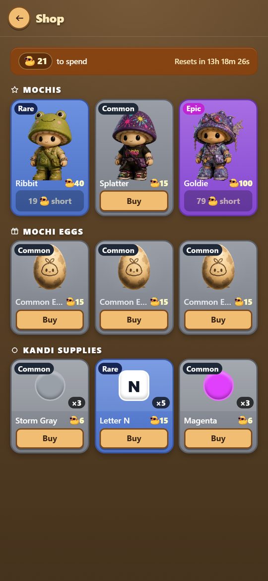
Trinkets are the everyday currency, and your balance lives in the top header of every screen in the app. Earn them from daily quests, achievements, checking in and the PLUR pledge. The shop rotates on a clock: Mochis and eggs every 12 hours, Kandi supplies every hour, each with its own countdown, so what is on the shelf now will not be there later. Three kinds of thing:
You can ♡ a Mochi you want so you get pinged when it comes back around.
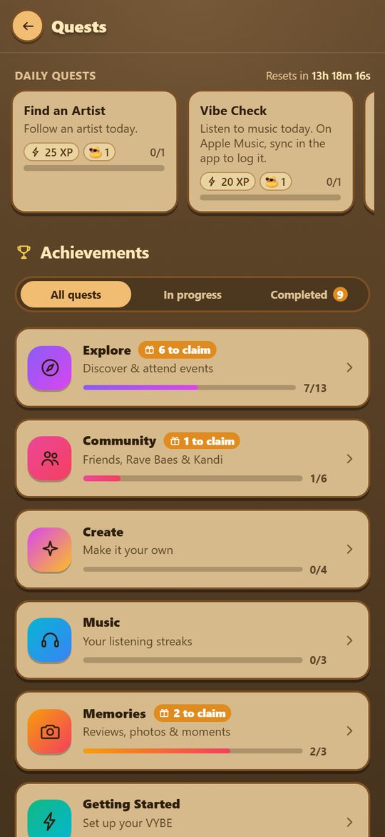
Two different things share this tab, and they work on different clocks.
Daily quests refresh every 24 hours with a visible countdown. Each one is small and states its exact XP and Trinket payout up front (“listen to music today”, “follow an artist today”), with a progress bar. They are designed to be things you were going to do anyway.
Achievements are the long game, grouped into tracks with their own progress: Explore (discover and attend events, plan your sets, help keep a Festival Map honest), Community (friends, crews and Kandi), Create (make it your own, and build a Mochi collection), Music (listening streaks) and Memories (reviews, comments and moments). Every track starts closed with its own count on the header, so the page is a short list you open rather than a wall you scroll; tap one to see what is inside. Filter to In progress or Completed, and anything finished shows a to claim flag, because rewards are claimed rather than dropped on you.
Progress updates while you watch. Follow an artist or save an event without leaving the page and the quest that wanted it ticks over there and then, rather than waiting for you to navigate away and come back.
Your Mochi is a companion and a profile picture, and nothing in the app is locked behind having a particular one. The grid shows every character in the game, owned or not, with a running Collected X of Y and whoever is currently your Companion. Sort by Rarity, Collected first, or just your Favorites, and ♡ any character to add it there. Set as Companion on any Mochi you own makes it your profile picture and the one that stands around in your chat backgrounds.
Four ways to get them:
A background is the scene your Mochi lives in: the stage at the top of the Oasis, the backdrop of your profile card, and the scene behind your messages, all at once. Everyone starts in PLUR Valley, the home one. Customize pages through the backgrounds you own with your Mochi standing in each, and See all opens the full gallery with every background in both its day and night versions. Three of them are earned by making friends: Coral Reef at 1 friend, Cosmic Village at 3 and Retro Arcade at 5. These are the first steps of the friends ladder in Quests, so finishing the quest is what unlocks the background. LittleLantern, the friend everyone starts with, does not count toward that ladder. A locked tile in the gallery tells you how many more friends to make before it opens, and once you have the friends but have not claimed the quest yet, an Unlock button sits on the tile; the art stays grey until you tap it.
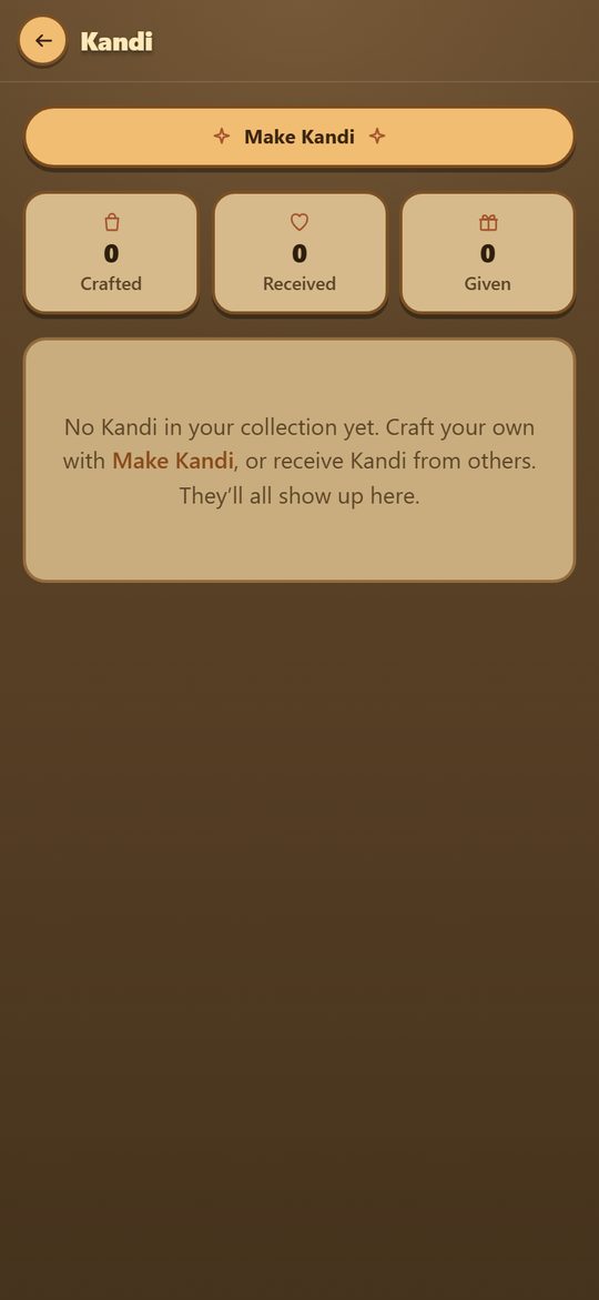
The crafter lets you build a bracelet bead by bead, add letter beads to spell something, and finish it with a charm. Your supplies sit under the ring in three trays, beads, letters and charms. Swipe between them or tap a tab, and tap a piece to add it. What you make is yours, and you can gift it to anyone, friend or stranger from an event chat, which plays the PLUR handshake on their end. Gifting works from both directions: pick a bracelet in your collection and choose the friend, or open anyone's profile, open the ⋯ menu and tap Gift Kandi to pick one of yours right there. When someone sends you one, a popup shows you the bracelet and who made it, with a Gift back button, once per gift, never more than one popup every few minutes, and never over something you are typing. A bracelet someone gave you stays yours for a week before you can pass it on. Some events hand every verified attendee a welcome bracelet the moment they check in, and that lands here too. Any souvenir bracelets minted at past festivals keep their festival label on the card; checking in now earns the event's attendance badge on your profile instead of a bracelet. Signing the PLUR pledge earns one too: claim the PLUR Pledge quest and the bracelet, PLUR spelled out with a heart for a clasp, lands in your collection like any other.
Unopened eggs sit here until you crack them. Rarity is set when the egg is earned, not when you open it. Opening one plays the crack, then shows the character off on its full card before it joins your collection.
The rules, and the questions people ask most.
This section is the full accounting. Every place another person can learn something about you, who exactly that person is, and the switch that turns it off. Nothing here is hidden in a policy document.
These are public to any signed in user, not just friends. There is no switch for most of them, so treat them as things you are choosing to publish:
All of these are on by default. All of them are in Settings → Privacy.
Location is the part people worry about most, so here is exactly how it works. VYBE reads your location in only two situations, and never in the background.
Checking in. One reading, at the moment you tap Check in, used to confirm you are inside the venue area. It is not stored as a position and it is not shared with anyone. Nothing tracks you afterwards.
Sharing your spot at an event. This is a separate, deliberate thing you turn on from the Festival Map header, and it has five hard rules:
To stop it immediately, open the Festival Map and tap the friends button in the header so it turns off. To stop it permanently, never turn it on: nothing else in the app enables it, and dropping a map pin never reveals where you are.
VYBE only works if it feels safe. The rules are short:
Full rules live in the Community Guidelines, and what we collect is in the Privacy Policy.
Settings has a Your data section, and it does what it says:
Disconnecting a music service deletes what we pulled from it too, not just the link. The principle throughout is that anything you gave the app, you can take back.
There is nothing to download. Everything works in a browser at vybeapp.app, and that is a real version of the app rather than a preview of one. Installing it to your home screen is optional and takes a few seconds:
Installed, it runs full screen with no browser bar and can send you notifications. On iPhone that last part only works once it is on your home screen, which is the main reason to bother. Native App Store and Play Store versions are on the way.
Yes. No ads, no subscription, no selling your data.
No. Follow artists and cities and the feed is fully personalized.
Only when you tap something that needs it: checking in at a venue, centering the Festival Map, or opting into sharing your spot with friends at an event. There is no background tracking.
Tap ⋯ next to the ✕ on the event card and pick Report a problem. It goes straight to us.
No. VYBE is an independent app and is not affiliated with, endorsed by, or sponsored by any festival, promoter, venue or artist named here. Event names are used only to identify the events themselves. Festival Map pins, vendor notes and prices are observations submitted by attendees. They can be wrong, out of date, or change hour to hour, so treat them as tips rather than official information. Anything official (schedules, maps, policies, prices) comes from the event's own channels. If you represent an event or vendor and want something corrected or removed, email support@vybeapp.app and we'll handle it promptly.
Still stuck, or have an idea? Email support@vybeapp.app.
A few things in VYBE are shaped the way they are on purpose, and they make more sense once you know the reasoning. These are the ones people ask about.
Now that you have seen the parts, here is how they sit together. Almost none of it is required, and there is no order you have to do it in.
The event card is the middle of everything. Nearly every feature in VYBE is either a way of getting you to one, or something living inside one. Open a show and it holds the whole night in one place:
It is the only step that unlocks other things, which is why it gets singled out:
That gate exists because a map and a live chat are only worth anything if the people using them were really there.
What you attend feeds what you get shown. Go to more, and the feed gets better at you. That is the only engine underneath the whole thing.
Find a show. Plan it with your people. Have a better day there. Keep the night.
The more you go, the better it gets at knowing what to show you next.
Find your next show
Social
The people half of the app: your friends, and everyone else.